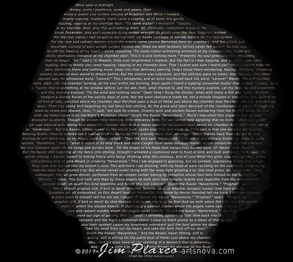
Edgar Allan Poe Portrait Using The Raven
Being a fan of Edgar Allan Poe and his poem The Raven, I decided to create a portrait of the author by using the text of his poem The Raven. The core idea was to create the portrait of Poe by modulating the brightness/darkness of the letters of the poem.
The first step in the creative process was to create a luminosity map of Poe's face. I did this by first locating a photograph of Poe on Wikimedia Commons. For reference, the photograph I used was Photograph of Edgar Allan Poe Taken by Edwin H. Manchester on November 9th, 1848. I then created a digitally painted version of that photograph that would be used to control the light levels of the text. This part of the process was fairly straight forward.
Assembling the text was also straight forward. The text itself came from Wikipedia (The Raven on Wikipedia). I edited the text so that it became one very long sentence. This was necessary so that the length of any single line could be lengthened or shortened depending on where it was located relative to the luminosity mask.
The most challenging aspect of this art project was in setting the font size and character spacing and line spacing. Too large and Poe's face wouldn't be big enough to hold all the text. Too small and I'd run out of text before Poe's face was complete. It certainly wouldn't do to have a chinless Poe. Fortunately, some basic math in concert with eyeballing progress allowed me to get the text sizing for the portrait just right in fairly short order.
There were some other creative considerations for this portrait. A couple ideas I toyed with involved warping the text so that characters would take on a more flowing or wavy appearance that coincided with their location in the portrait's luminosity mask. I also thought about giving the individual lines a wavy base so that the words would move up and down relative to one another. In the end I opted to not implement these features as they would make the text much more difficult to read. And I do want people to be able to read the poem.
One thing I did do, which I still have mixed feelings about, was to take the luminosity mask painting and apply it at a very low opacity as the base layer. Artistically I feel that it distracts from the purity of a solely text-only portrait. But it does seem to make the text slightly easier to read (again with the readability).

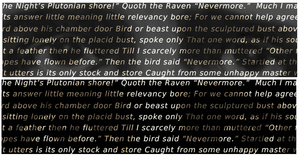
Illustration of Edgar Allan Poe Portrait simulating actual print size on a 96dpi screen.
Top: With luminosity mask as published. Bottom: Without luminosity mask.
The finished portrait of Edgar Allan Poe is 21 by 21 inches square printed at 300 pixels per inch. I've made this artwork available on a variety of products on Redbubble. While the text of The Raven is very easy to read when printed full size (see the illustration above), you are not going to be able to read the poem if you order it as, for example, a case for your smartphone or on a coffee mug. Sure, Poe's face will be easily recognizable but the individual letters of the words will be just too small to read. People will just have to take you at your word when you tell them that Poe's portrait is composed of the full text of the poem The Raven.
So you can support me and show your love of Poe by clicking the button below and taking a look at some of the products to which this artwork has been applied.
Portrait of Edgar Allan Poe Using the Poem The Raven on Redbubble
Jim Plaxco's Art Portfolio on Redbubble
Sign up to receive my digital art and photography newsletter
| Return to the Blog Index | This entry was posted on Tuesday, March 19th, 2019 at 11:11 am and is filed under Art and Artists, Artworks, Creative Coding, Digital Art, New Media Art, Portrait Art.
