Grand Opening of Adobe Museum of Digital Media

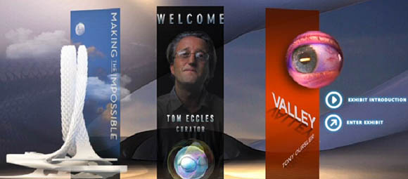
Adobe Museum of Digital Media Main Menu
Yesterday was the grand opening of the Adobe Museum of Digital Media and I was looking forward to my visit to this virtual museum of digital art. Arriving at the site – Adobe Museum of Digital Media – I found myself waiting for the museum to open in my browser. Unfortunately Adobe decided to implement their virtual museum as a completely Flash web site and that Flash file is really, really big. Even with my top of the line broadband internet connection, I had to wait some 45 seconds for the museum to open. A few browser reloads gave times in the 40-45 second range.
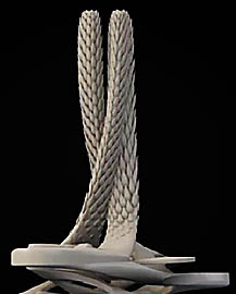
The museum opens with a city fly-around that focuses on the virtual museum building itself. This virtual building, a large white stylish futuristic looking building quite at odds with the surrounding cityscape, was designed by Italian Filippo Innocenti, an associate architect at Zaha Hadid Architect.

Adobe Museum of
Digital Media
Virtual Building
Upon completion of the fly-around the visitor is presented with three navigation options. One of these options is to see a message from the museum's curator Tom Eccles, executive director and faculty member of the Center for Curatorial Studies at Bard College. The message is a brief introduction to the museum and the concept.
The second navigation option is to take a building tour. One of the sub-options, AMDM Cityscape allows you to replay the opening video. A second sub-option is Making the Impossible which opens a video describing the creation of the Adobe Museum of Digital Media with emphasis on the design of the virtual building that is meant to represent the museum.
The third navigation option is for the current exhibit. In terms of the actual art content, the current (and first and only) exhibit is Valley by Tony Oursler. I did not visit much of the exhibit because I did not find it to be particularly accessible from a user perspective.
There is also an option on various sub-pages to become a member by providing your email address and creating a user name. I joined as I am curious to observe how Adobe's virtual museum evolves.
And Now – The Art Museum Review
My visit to the Adobe Museum of Digital Media was a disappointment. Not only does the initial page take an overly long time to load, but it also takes just as long for many of the sub-pages to load. In short, the site has a terrible time-to-content ratio – in fact the worst that I have ever experienced. Nor was I thrilled that the museum wound up kicking my laptop cooling fan into overdrive.
As to site navigation, at times it was not intuitively obvious where to click or where that click would take you. The flying eyeball that serves as your museum guide between the base pages was cool but only slowed things down more.
In conclusion, it looks like Adobe's principal goal is to show off the virtual building they created to host the museum and to show off Flash's visual capabilities. I think the public would have been better served if Adobe had concentrated on offering visitors a user friendly format in which to view digital art and to provide informative content in support of that art.
Visit the Adobe Museum of Digital Media
| Return to the Blog Index | This entry was posted on Wednesday, October 6th, 2010 at 11:52 am and is filed under Art and Artists, Digital Art.