Judging the NASA Lunar Art Contest

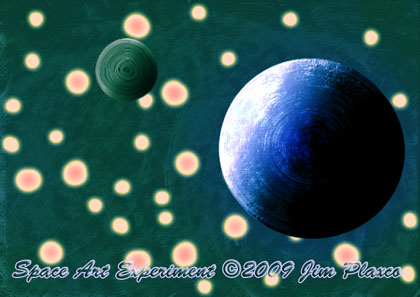
A Space Art Experiment just for this post
I spent a good part of the day Sunday judging the art that had been submitted to the NASA Life and Work on the Moon art contest. Last year I served as a judge in this contest and was pleased to be invited back again this year. The contest's art judges fall into two categories. One category consists of NASA personnel – the techies. The other category is professional artists and educators from outside of NASA. I wrote about my experiences last year in Judging the NASA Life and Work on the Moon Art Contest.
Two things made judging the art contest entries difficult. First, while the contest was open only to full time students, the age of the entrants ran from 6th graders to college graduate-level students. Note that the contest was supposed to be for high school and college students only but given that these younger students had undertaken the effort to create art for the contest, how could they be turned away? My hat is off to NASA for having accepted their entries. A second aspect of the art contest that added difficulty was that entries consisted of 2D art (digital and traditional paintings, drawings, etc), videos, music, sculptures, and dioramas. A very diverse range of art forms from a very diverse range of ages.
Judges were asked to grade the submissions based on three categories. The first was the Artist Statement. The purpose of the Artist Statement was to give the students the opportunity to explain what it was that inspired and motivated them with respect to their submission, what media they chose to use and why, and any additional comments they cared to make about their art submission.
The second category was Creativity and Artistic Expression. This was the most important judging category and also the most subjective. For my part I took into consideration how the artist used composition, color, and line in creating their artwork. I also considered how realistic – or plausible – the subject was. Lastly I considered both the quality of the technical execution involved and the relevance of the art to the contest's stated theme of living and working on the Moon.
The final category was Validity. For validity, the basic question to be answered was did the artist's Artist Statement and artwork demonstrate a basic understanding of the lunar environment and the conditions in which people would live and work on the Moon. Some of the student artists demonstrated a surprising degree of knowledge in this respect while others demonstrated some very basic misunderstandings of that environment. In some respects this was the most difficult category to evaluate. The degree to which a contest entrant demonstrated their level of knowledge was very dependent on the nature of their submission. For example, the music submission dealt with the emotions felt by an astronaut returning to the Moon from Earth. Generally for those submissions for which the artist's level of knowledge regarding the lunar environment could not be determined, I gave them a Validity grade that was in line with the grade I had given them for their Artist Statement and Creativity and Artistic Expression.
For my part I am anxious to see the final results of the contest – if just to find out how well the entries that I gave top scores to did. I will post a follow up here once the winners of the art contest are announced.
The Illustration
To illustrate this post I decided to create a quick work of space art using Adobe Photoshop. One of the books I'm reading right now, a book I highly recommend, is How to Read a Modern Painting: Lessons from the Modern Masters by Jon Thompson. One of the paintings discussed in this book is Road with Men Walking, Carriage, Cypress, Star, and Crescent Moon by Vincent van Gogh. Being astronomically oriented, my focus was on van Gogh's portrayal of the sky, star, and Moon.
For my Space Art Experiment picture I experimented by creating a textured background sky from overlapping circles, creating nonuniform stars each with a color gradient, and finally adding a planet and moon created from a series of imperfectly aligned colored circles subsequently shaded to reflect a day/night side to each.
While generally pleased with how this experiment turned out, I don't know that I am sufficiently excited by it to create a full size print version using the same techniques. What do you think?
Recommended Reading
How to Read a Modern Painting: Lessons from the Modern Masters
by Jon Thompson
| Return to the Blog Index | This entry was posted on Tuesday, May 5th, 2009 at 9:57 am and is filed under Space Art.