New Art and the Artsnova Web Site Redesign

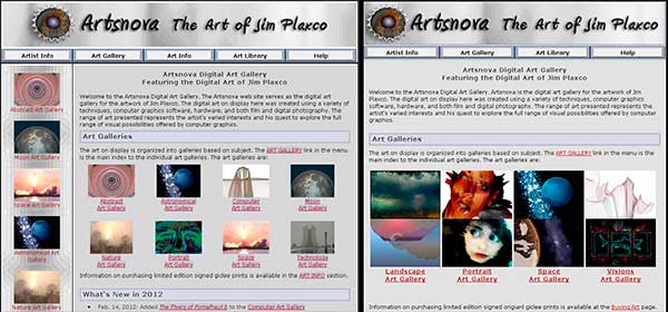
Artsnova Web Site Redesign Before (left) and After (right)
Finally after a couple months of somewhat intermittent work I have deployed the redesigned version of my Artsnova Digital Art Gallery web site. One big consequence of the redesign is that I now have a much larger portion of my art online. Prior to the redesign I had 79 artworks on the site. As a part of the redesign I added 117 additional works of art (creating the additional 117 web pages for the art involved more work than the actual redesign!). The art I've added spans a number of years – going all the way back to 2002. Much of this is art that I have not previously made available for sale.
I also took this opportunity to remove all the photography from my web site. My plan is to, at some time in the future, create a separate web site for my photography. One site dedicated to art and another site dedicated to photography is a much more appropriate approach from both a business perspective and a search engine optimization perspective. So now I have total of 188 works of art on my site – with yet more to add as I find the time.
Back on the subject of the redesign, my five objectives in redesigning my site were:
- to widen the content area to support larger images for the art gallery
- to simplify and streamline site navigation
- to reduce the number of art gallery subject categories
- to give the design a cleaner look primarily by eliminating the sidebar
- to prepare the site to be upgraded to a responsive design for mobile browsers.
Widening the Content Area
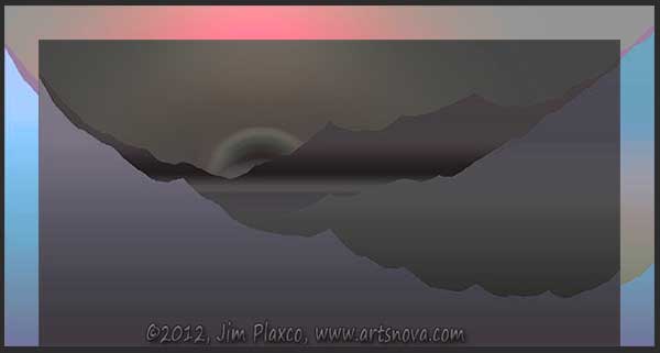
For me the most important part of the redesign was to widen the content area so that I could use larger images to display my art. In the figure below, you can see a before and after image of one of my artworks – Beyond the Mountains

Beyond the Mountains Gallery Art Before and After
The darkened, desaturated component shows the area of the original image and the larger, colored background image shows the new size. It may not look like much but going from 600 to 670 pixels wide makes for a large difference on smaller screens.
Streamline Site Navigation
The second most conceptually difficult part of the redesign was to simplify site navigation so that I could eliminate an entire category of links. This required a rethinking of how I would organize content – while keeping in mind that the critical factor was making it as easy as possible for visitors to find what they were looking for.
Reduce the Number of Art Galleries
The most difficult part of the redesign was figuring out how to reduce and organize the number of art galleries I had on my site. With the old design, art was organized into the following eight different categories:
- Abstract Art
- Astronomical Art
- Computer Art
- Moon Art
- Nature Art
- Portrait Art
- Space Art
- Technology Art
Combining the Moon and Astronomical galleries into a Space gallery was easy. How to handle the abstract, nature, and technology categories proved to be much more difficult. For information about the new galleries and an explanation as to the contents of each, see the Art Gallery Index
A Cleaner Look
Giving the site a cleaner look was easy. Shrink the masthead, eliminate the sidebar, reduce the number of top level site navigation categories from five to four, and reduce the overall page width. The serendipitous aspect of this was that by eliminating a navigation category and the sidebar, I was able to decrease my overall page width while simultaneously expanding the content area.
Responsive Design Preparation
One of my many objectives for the coming year is to create a mobile-friendly version of my web site using what is known as responsive web design. The redesign accomplished this by simplifying the html page structure. This should make it easier for me to code up a responsive design. Stay tuned.
Now for the Bad News
The bad news is that I have not yet modified the template files for this blog so my blog is now not one but two generations of redesign out of sync with my web site. One of these days hopefully I will find the time to go in and redesign my blog so that it matches my web site.
If You Find An Error
If you find an error or mistake on one of the Artsnova pages, please consider dropping me a line. You can use the Artsnova Blog Contact Form to reach me.
Thanks and happy surfing, Jim
| Return to the Blog Index | This entry was posted on Saturday, March 2nd, 2013 at 4:19 pm and is filed under Digital Art, Web Design.