A New Website Design for Artsnova

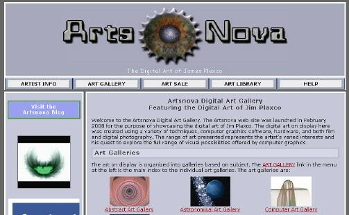
The new Artsnova web site design
Thursday night I rolled out a new version of my Artsnova web site. My primary goal in redesigning my web site was to make the site's navigation system more user friendly. If you want to know what the original version of the Artsnova web site looked like, look no further for I had designed the templates of this WordPress blog to provide a seamless integration between my website and blog. The only difference between the blog and web site was the content of the sidebar. On the web site, the sidebar consisted of a secondary navigation system and some internal advertisements which varied from page to page.
Whereas in the original design the site navigation was split between a horizontal nav bar below the masthead for section navigation and a vertical navigation menu in the sidebar for intra-section navigation, I combined both into a single CSS driven drop-down menu in the new design. This makes it much easier for visitors to find what they're looking for and to move around the web site quickly.
Another benefit of the new single menu system is maintenance. The dual menu system meant that there were structural differences from one page to the next. The new single menu system combined with a standardized sidebar means that the header, navigation, and sidebar divs are identical for all my web pages. Since I am not using either a CMS (Content Management System) or SSI (Server Side Includes) to manage my web pages but am instead coding them all up the old fashioned way – by hand – this standardization can save me quite a bit of time when adding new pages or undertaking site-wide changes.
My secondary objective was to clean up and standardize my sidebar elements and add social media linkage. I recently put the addthis.com social media bookmarking tool on a few of my pages for testing. In this redesign I have added the addthis widget to all my pages. I've also added the Facebook feed for my Facebook page to the sidebar. The only wrinkle is the Facebook widget which tends to be somewhat erratic in getting data back from Facebook on the initial load.
My final objective was to tweak the aesthetics of the page layout. The changes I made to the divs which control the design were minor but, to my eye, improve the overall appearance of the site.
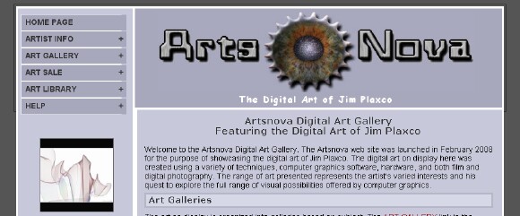
I actually had two competing designs and the design I've gone with is the second. The principal difference between the two designs is that the design-not-chosen uses a vertical drop-down navigation menu in the sidebar to the left of the masthead for site navigation. I really liked the way this Javascript/CSS menu looked and worked. It really created a nice compact design as you can see in the screen shot below.

The alternate Artsnova web site design
In the end I decided against this design for two reasons. First I don't like to employ Javascript for something as crucial as site navigation. If someone has Javascript turned off, while the menu still displays and functions, it does not collapse and consequently becomes a very long string of sidebar buttons. Second, the Javascript did take a small amount of time to actually build the menu and while this was going on, the raw html menu elements were exposed to the visitor – the same as if Javascript were turned off.
Overall I'm quite pleased with the way the design turned out. I hope that visitors to the site find that it is now easier to navigate from one section to the next. At some point I will need to redo my WordPress templates in order to provide seamless navigation between the web site and blog but that will have to wait for another day.
| Return to the Blog Index | This entry was posted on Saturday, June 4th, 2011 at 8:35 am and is filed under Computing, Odds and Ends, Web Design.